SaaS AI Dashboard
Client: Google · Role Senior UXD · Launched 2024·
Google Cloud's data professionals rely on Dataproc to catch system failures fast — but its dashboards had grown denser than the systems they monitored. In three weeks, I led UX across a team of sixteen to ship an MVP built around the three questions users actually ask in a crisis: What happened? Why? How do I fix it?
Define: The Problem
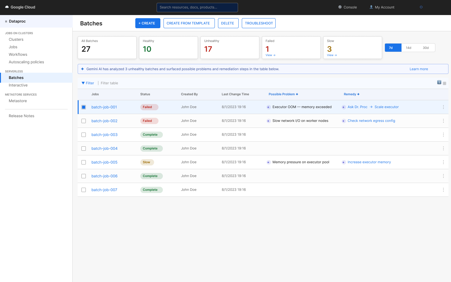
Dataproc was a complex monitoring system where, as workloads scaled, users struggled to troubleshoot issues quickly. The interface exposed a lot of data, but not in a way that supported decision-making. This was increasing support load and slowing engineering workflows.

Feature Prioritization
Through early scoping and user feedback, I realized users weren’t trying to explore the system—they were trying to solve a problem.
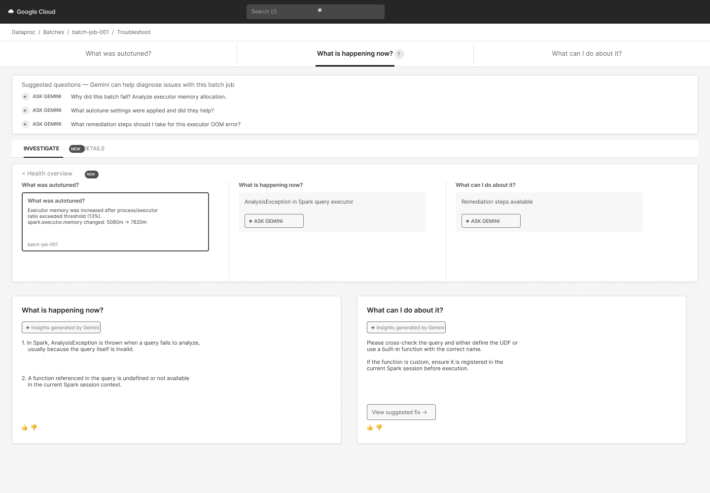
Every troubleshooting moment boiled down to three questions:
What happened?
Why did it happen?
How do I fix it?
The existing UI forced users to find the answers themselves across fragmented views, dashboards, and products.
Decision
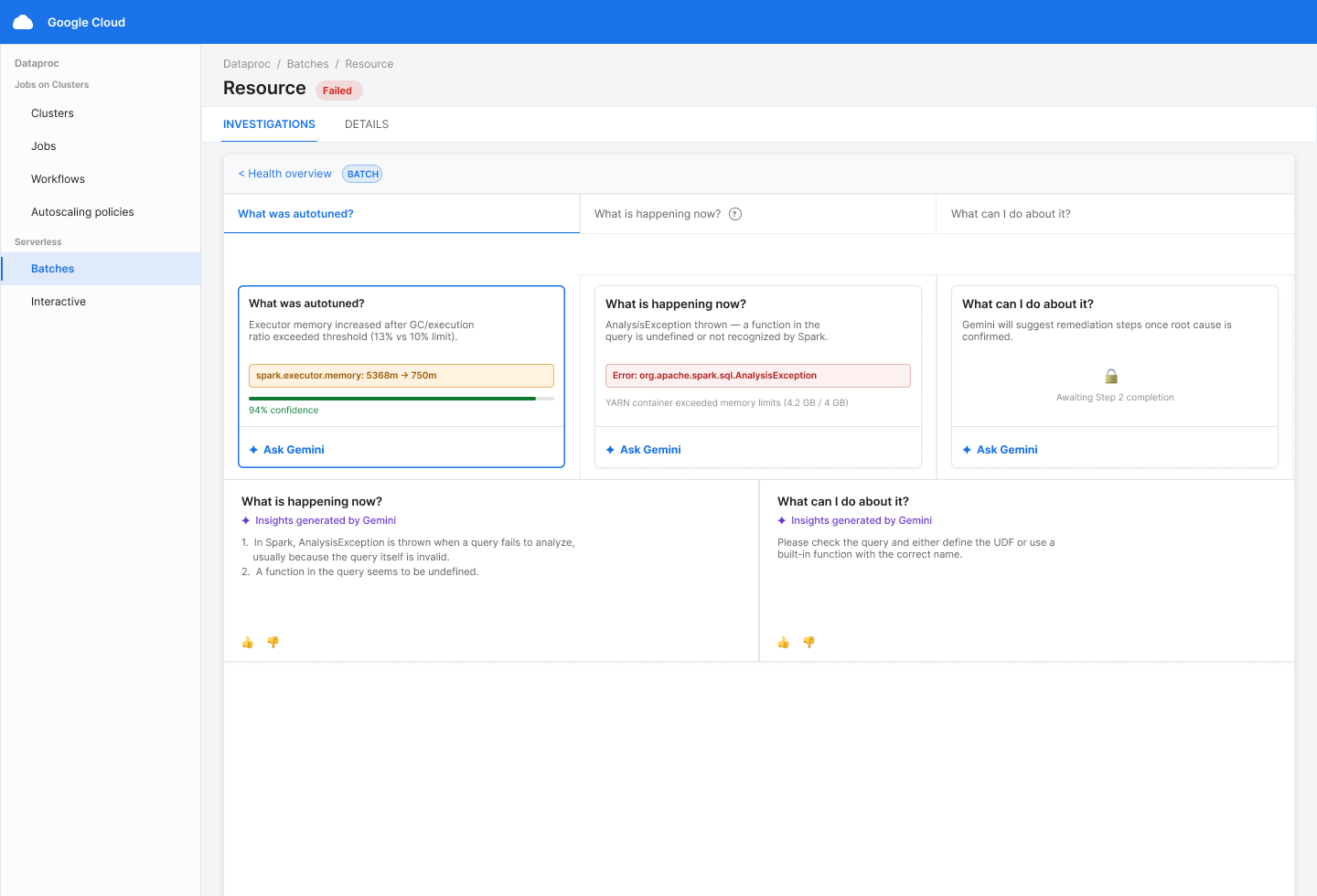
I made a deliberate tradeoff to reduce flexibility in favor of clarity.
Replaced visual-heavy dashboards with numeric scorecards optimized for fast scanning
Consolidated insights into a single troubleshooting summary
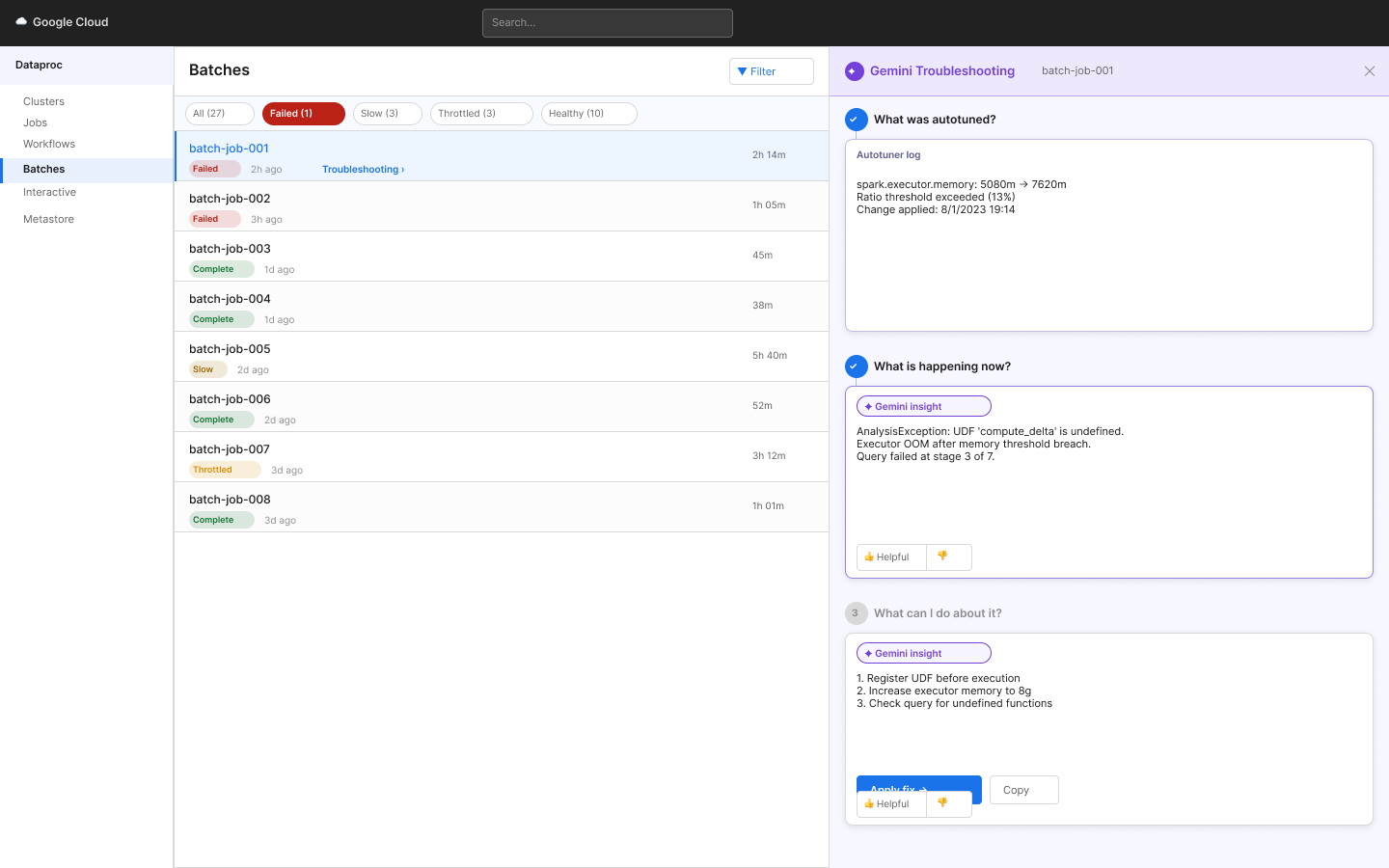
Instead of distributing AI across the UI, I focused it into one embedded “Ask Gemini” flow at the point of need
This required pushing back on adding more AI entry points and aligning PMs on a single integration strategy.
Designing for Gemini
Post-MVP, five new PMs arrived with five ideas for where AI should live.
The risk: reintroducing the complexity we'd just stripped out. I pushed the team toward three rules — one entry point inside the batch flow, a consistent icon system for AI output, and staged responses with feedback between steps.